Analysis Results and Visualization
Single Analysis
Volcano Chart Gene
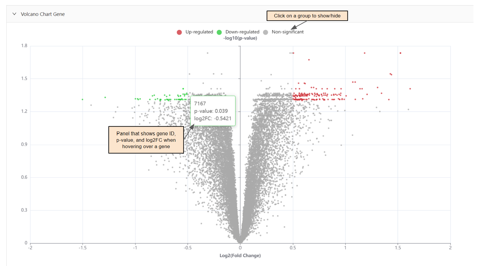
Components:
Genes are grouped in up-regulated(red), down-regulated(green), and non-significant(gray).
If the gene is colored(not gray), it indicates that there is a significant difference in gene expression(fold change).
The higher the point, the more significant it is.
Panel outlined with group color that shows gene ID, p-value, and log2FC when hovering a data point.
Export.
How to:
Show/hide a group: Click the group in the chart key.
Mean Average Expression Chart
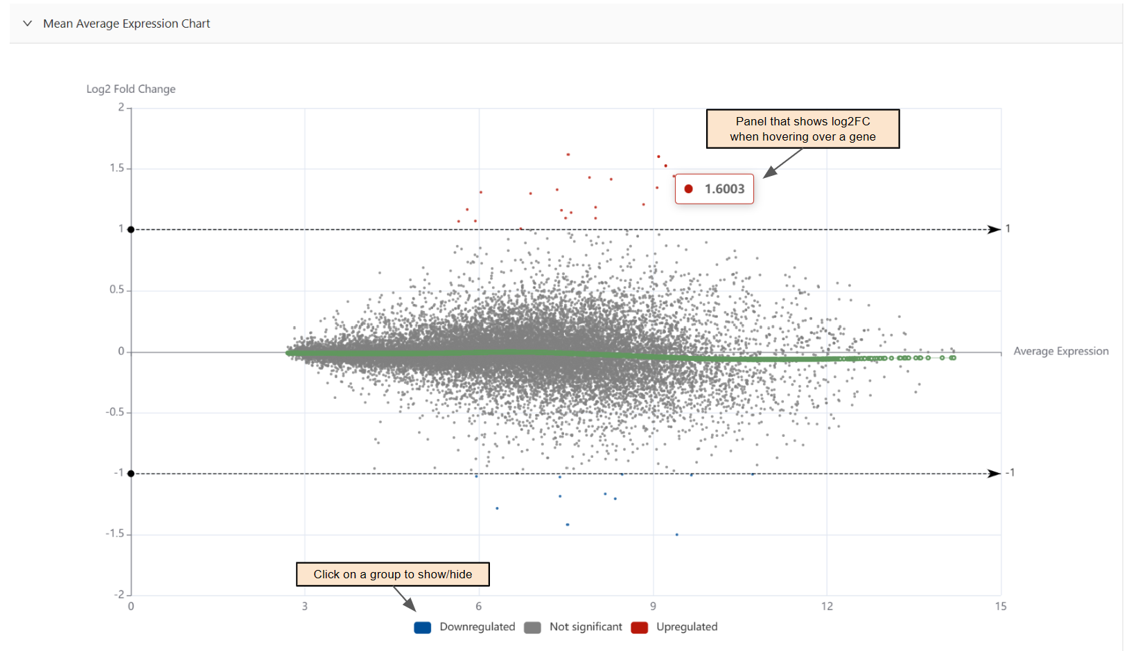
Genes are grouped in downregulated(blue), upregulated(red), and not significant(gray).
Panel that shows the log2FC of a point when hovering.
Export.
How to:
Show/hide a group: Click the group in the chart key.
Circos Chart
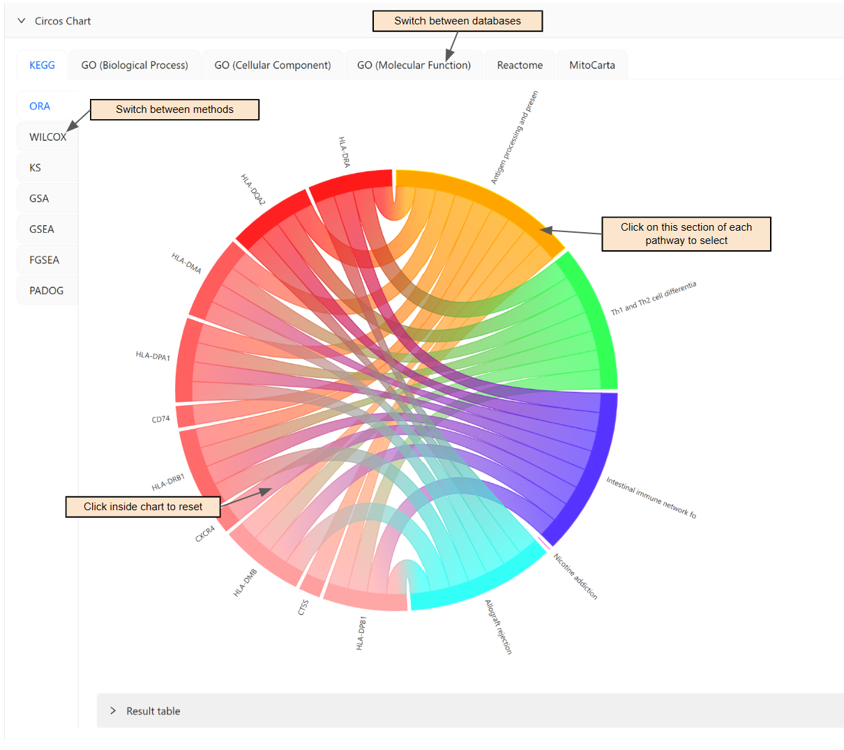
Result table.
How to:
Select a specific pathway: Click the pathway's section on the circumference of the circle.
Reset chart: Click inside the chart.
Pathway Volcano Chart
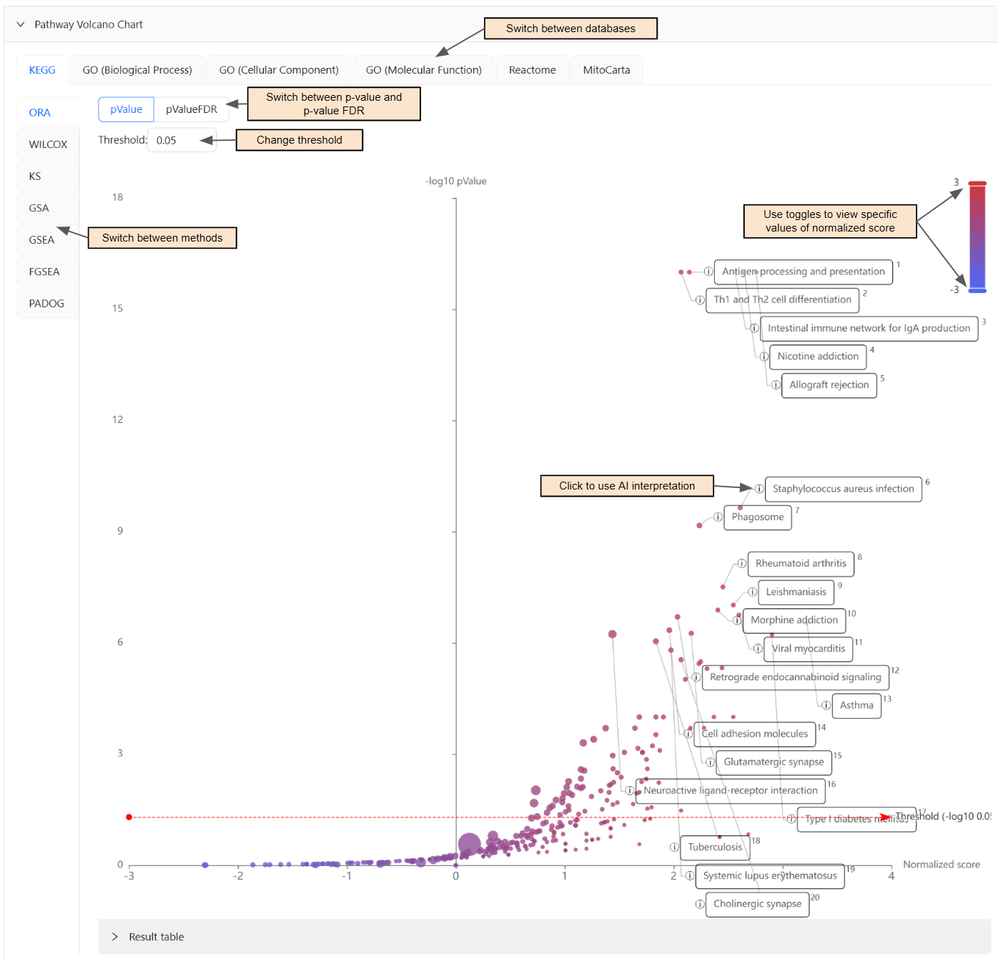
Significant pathways are high and to the right of the chart.
Panel that shows pathway name when hovering.
Result table.
Export.
How to:
Use AI Interpretation: Click the information icon (i) beside significant pathways.
Change threshold: Edit the threshold input.
View specific values of Normalized score: Slide the toggles up/down in the top right corner of the chart.
Forest Chart
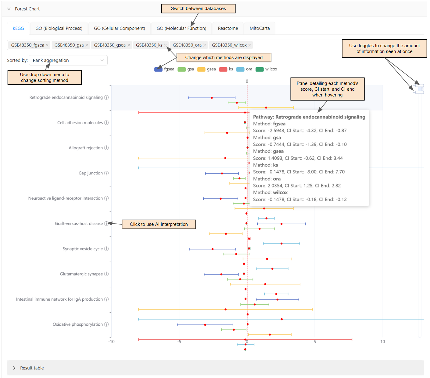
Compare the score of different methods within a pathway.
If a method is to the right of the central vertical line, it is up-regulated. If it is to the left, it is down-regulated.
If the confidence interval intersects with the central vertical line, it is statistically insignificant.
Panel detailing each method's score, CI start, and CI end when hovering by pathway.
Result table.
Export.
How to:
Use AI Interpretation: Click the information icon(i) beside the pathway name.
Sort the chart differently: Use the dropdown menu for
Sorted by:.Change which methods are displayed: Click the method in the chart key or select/unselect.
Change the amount of information seen at once: Slide the toggles up/down on the right-hand side.
Bar Chart
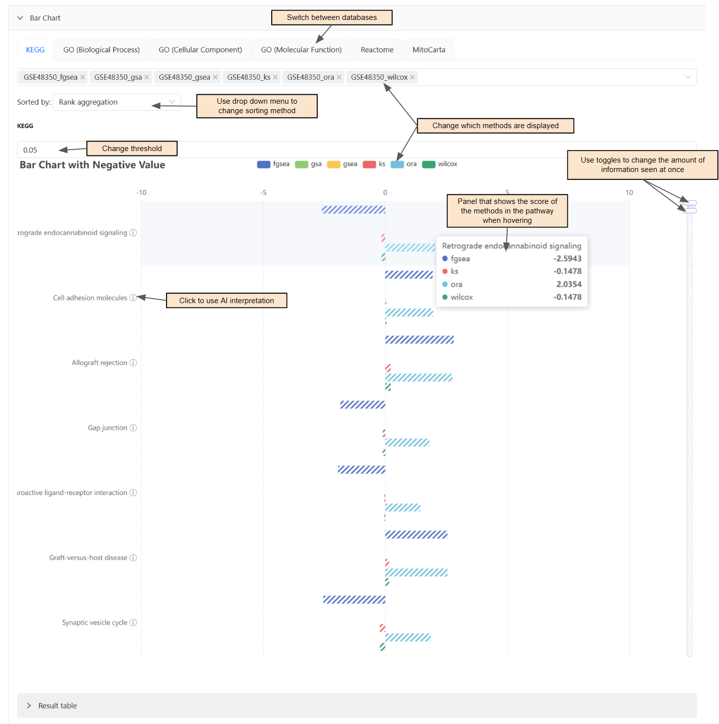
Compare the score of each method in a pathway.
If a method is hashed, it is significant.
Panel that shows the score of the methods in the pathway when hovering.
Result table.
Export.
How to:
Use AI Interpretation: Click the information icon (i) beside the pathway name.
Sort the chart differently: Use the dropdown menu for
Sorted by:.Change which methods are displayed: Click the method in the chart key or select/unselect.
Change the threshold: Change the value above the chart.
Change the amount of information seen at once: Slide the toggles up/down on the right-hand side.
KEGG Pathway Map
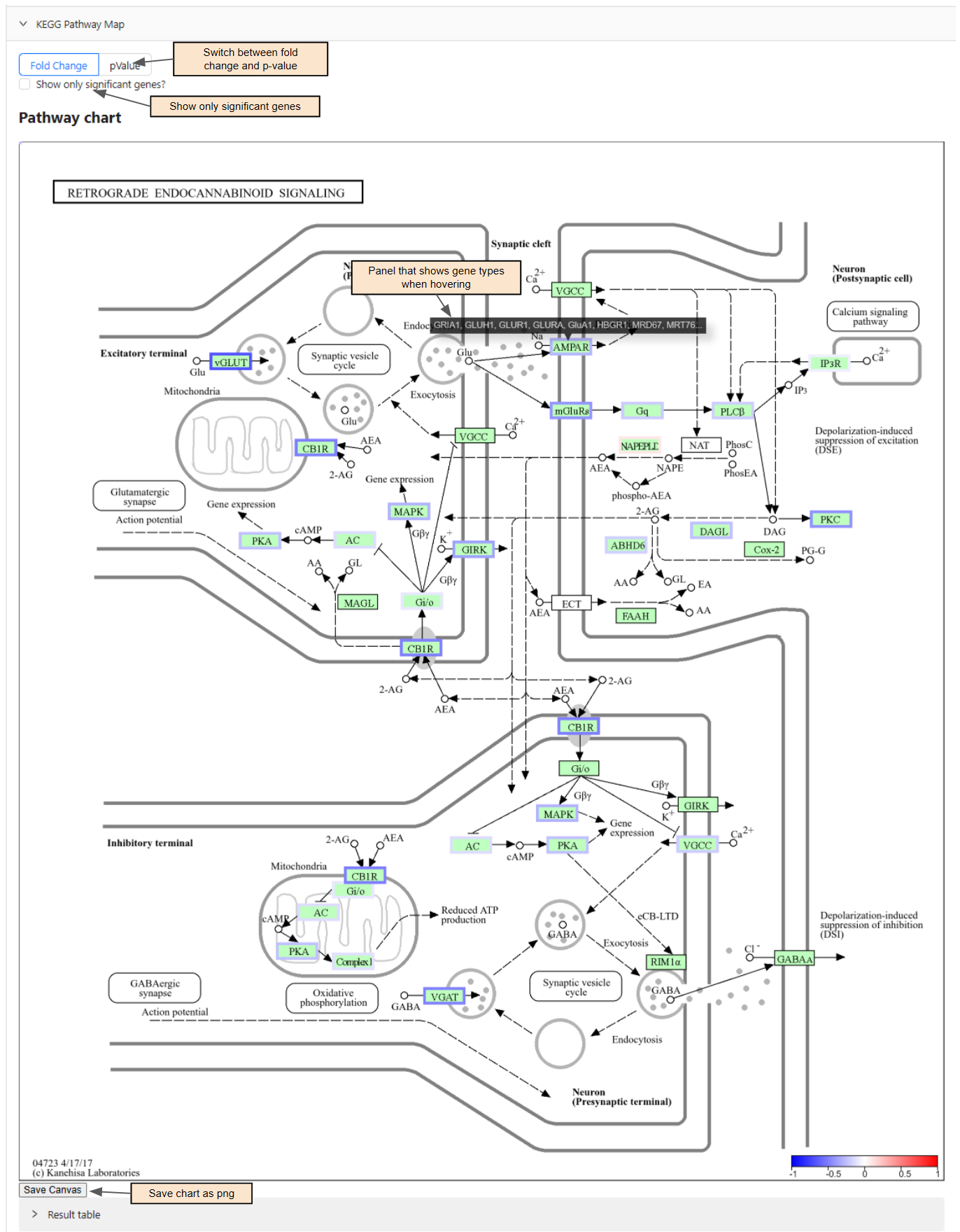
Significant genes are outlined.
Refer to legend for up-regulated and down-regulated.
Panel that shows gene types when hovering over the outlined.
Result table.
How to:
Export chart: Press
Save Canvasand it will download as a png.Show only significant genes: Select
Show only significant genes?Change threshold: Area to change shown only after selecting the above.
Pathway Network
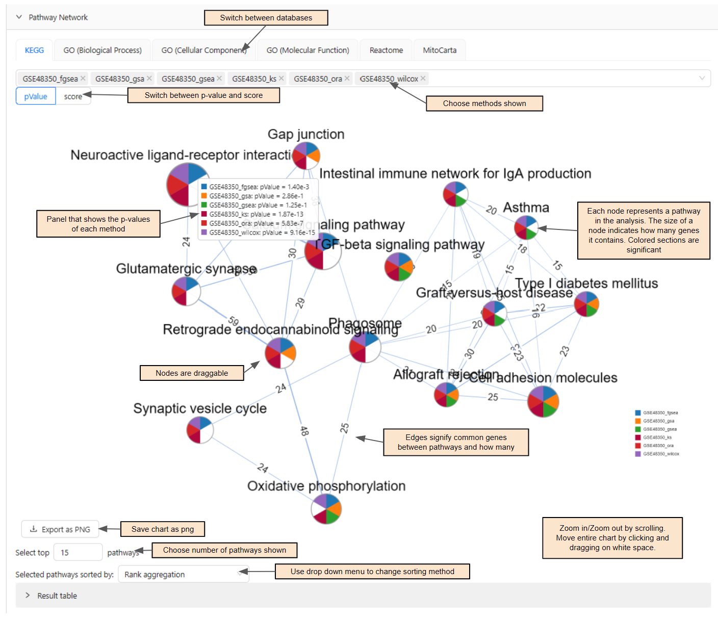
Each node represents a pathway in the analysis. The size of each node indicates how many genes it contains.
Edges signify that there are common genes between pathways and indicates how many there are.
Panel that shows the p-values of each method.
Result table.
How to:
Navigate chart: Click on node to drag it around, scroll up to zoom in, scroll down to zoom out, and drag in blank space to move entire chart.
Choose which methods are shown: Select/unselect method.
Change the amount of pathways shown: Input value into
Select top ___ pathways.Sort the pathways differently: Use the dropdown menu beside
Selected pathways sorted by:.Export chart: Press
Export as PNGand it will download as a png.
Meta Analysis
Venn Diagram
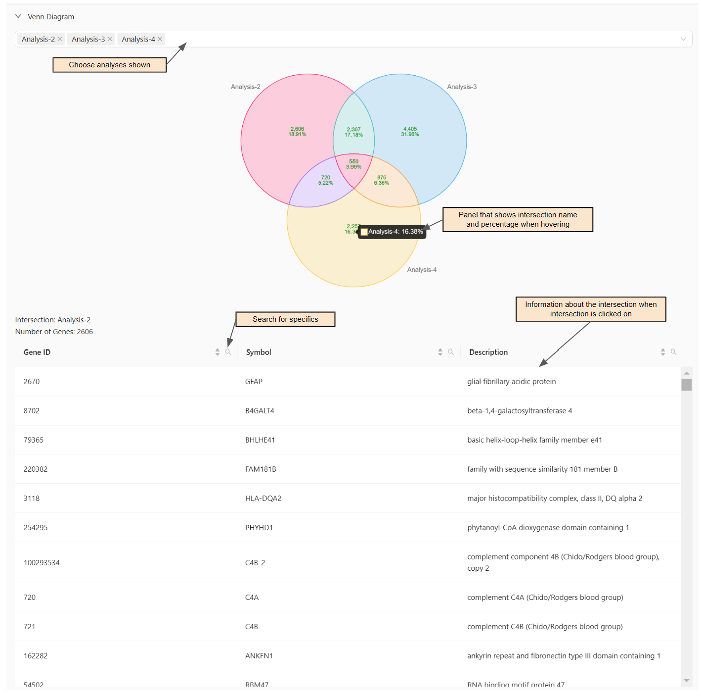
Shows the amount of genes and percentage for each applicable analysis/intersection.
Panel that shows intersection name and percentage when hovering.
How to:
Choose which analyses are used: Select/unselect analysis.
View specific information for intersection: Click the intersection to view Gene ID, Symbol, and Description.
Search for specific Gene ID, Symbol, or Description: Click on the search icon in the headers.
Heatmap Gene
Components: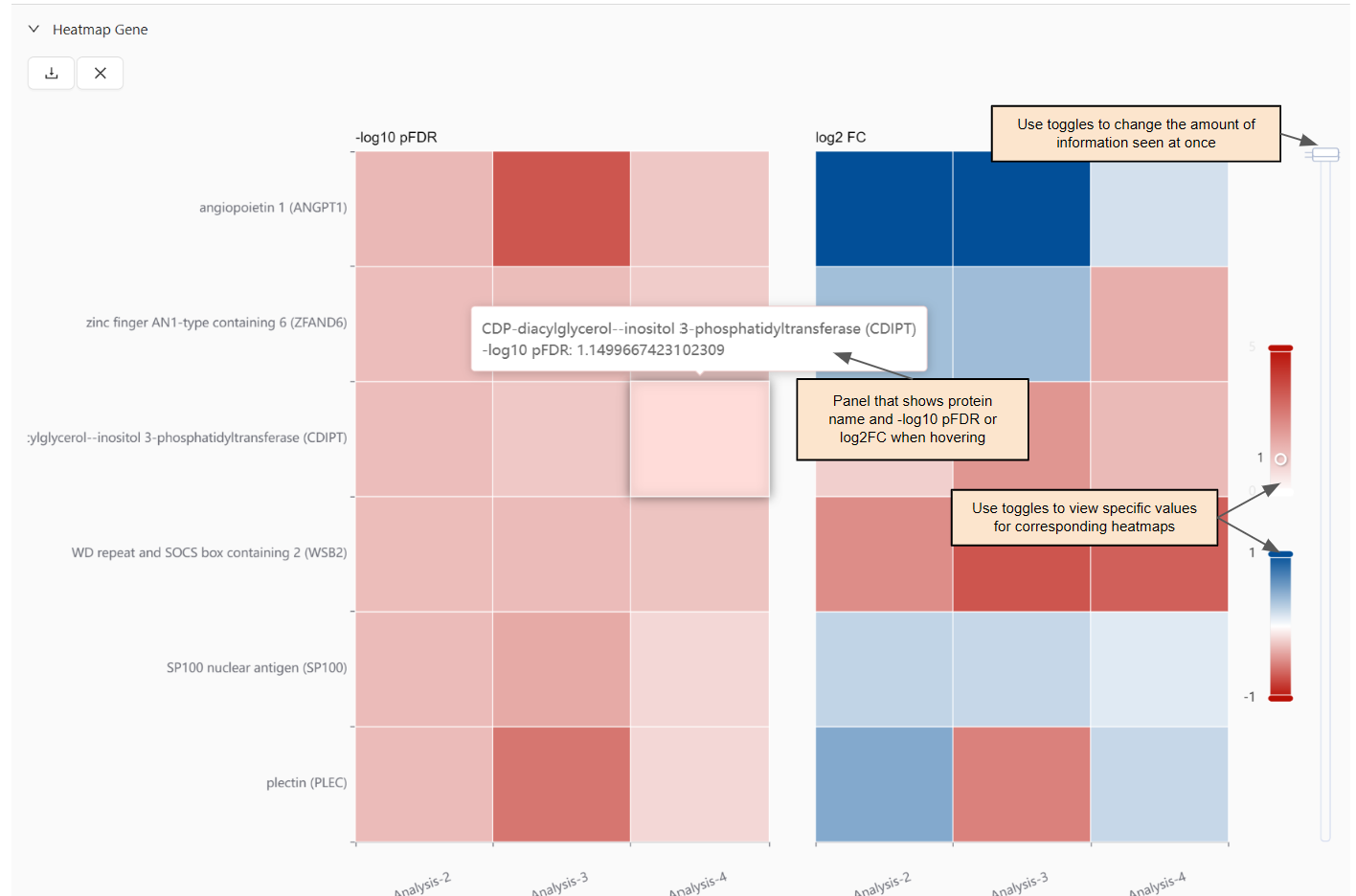
Heatmaps of -log10 pFDR and log2FC by protein for each applicable analysis.
Panel that shows protein name and -log10 pFDR or log2FC when hovering.
Export.
How to:
View specific values: Slide the toggles up/down for the corresponding heatmap.
Change the amount of information seen at once: Slide the toggles up/down on the far right.
KEGG Map Multi Analysis
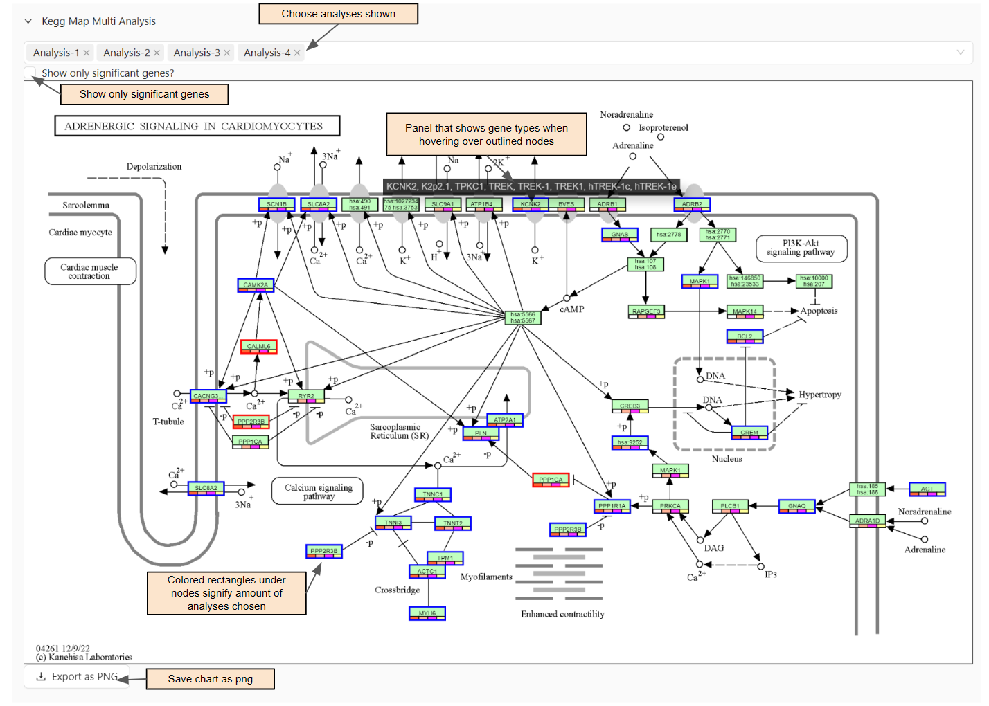
The number of color rectangles in the bottom of a node corresponds to the number of analyses included in the session (refer to legend).
Significant genes are outlined
Refer to legend for up-regulated and down-regulated.
Panel that shows gene types when hovering over the outlined.
How to:
Change which analyses are used: Select/unselect analysis.
Export chart: Press
Save Canvasand it will download as a png.Show only significant genes: Select
Show only significant genes?Change threshold: Area to change shown only after selecting the above.
Note: KEGG Map Multi Analysis does not produce a visualization until analyses are chosen.
Heatmap
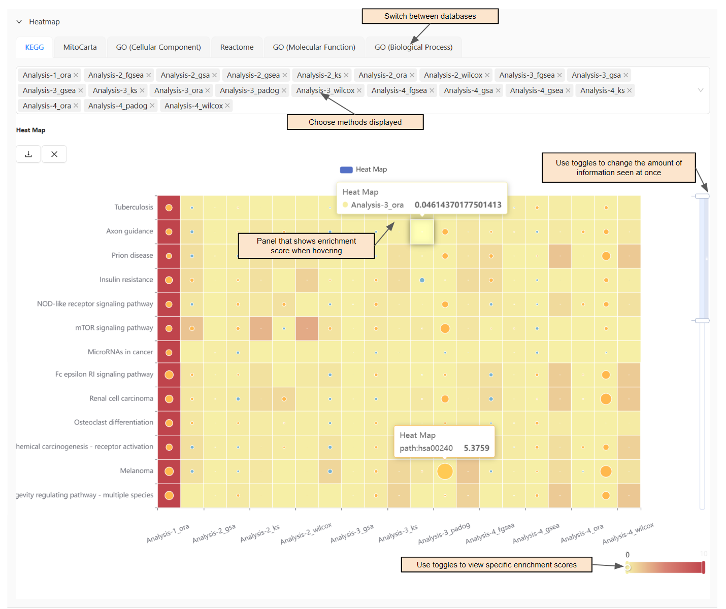
Panel that shows the enrichment score for method of pathway when hovering the big square and a path when hovering the circle.
If the enrichment score is greater than 1, it is overrepresented.
Export.
How to:
Choose which methods are shown: Select/unselect method.
Change the amount of information seen at once: Slide the toggles up/down on the right-hand side.
View specific values of some value: Slide the toggles left/right in the bottom right corner of the chart.
Multi Analysis Forest Chart
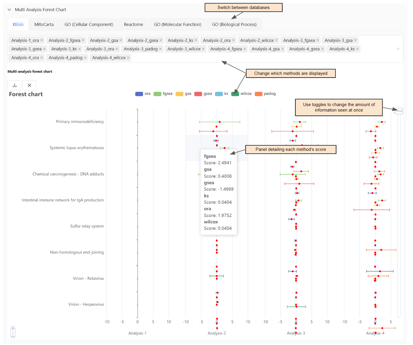
Compare the score of different methods within a pathway between analyses.
If a method is to the right of the central vertical line, it is up-regulated. If it is to the left, it is down-regulated.
If the confidence interval intersects with the central vertical line, it is statistically insignificant.
Panel detailing each method's score.
Export.
How to:
Change which methods are displayed: Click the method in the chart key or select/unselect.
Change the amount of information seen at once: Slide the toggles up/down on the right-hand side.
Multi Analysis Pathway Network
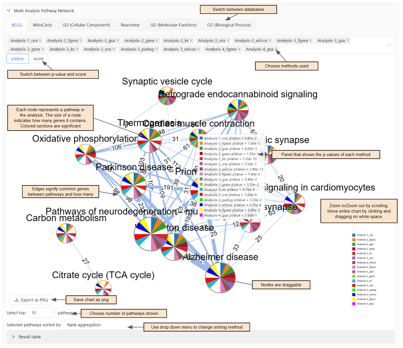
Each node represents a pathway in the analysis. The size of each node indicates how many genes it contains.
Edges signify that there are common genes between pathways and indicates how many there are.
Panel that shows the p-values of each method.
Result table.
How to:
Navigate chart: Click on node to drag it around, scroll up to zoom in, scroll down to zoom out, and click on blank space to move entire chart.
Choose which methods are shown: Select/unselect method.
Change the amount of pathways shown: Input value into
Select top ___ pathways.Sort the pathways differently: Use the dropdown menu beside
Selected pathways sorted by:.Export chart: Press
Export as PNGand it will automatically download.
Common Components
Result table
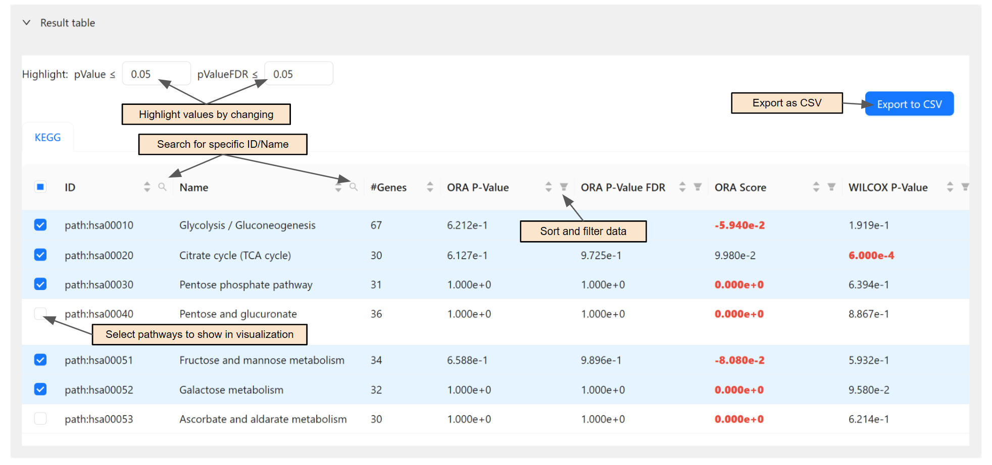
Highlight values: Change the thresholds for p-value and p-valueFDR.
Select pathways to be shown in the visualization: Use the selectors.
Sort and filter data: Click on the header for the desired column.
Search for specific ID/Name: Click on the search icon in the header for ID/Name.
Export to CSV: Click
Export to CSV.
Export
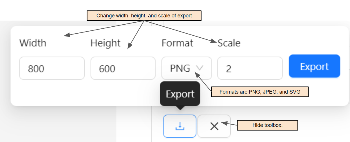
Generally appears in the top left corner of the chart.
Export as PNG, JPEG, or SVG.
Change width, height, and scale of export.
How to:
Hide toolbox: Click the
x.Un-hide toolbox: Refresh page.